The Problem
Urdu Media Monitor had begun as a small project started as a hobby, and so the logo was generic and (in the words of the editor) “embarrassing”. The site’s audience eventually grew over time and the editor decided that it was time for a change.
The Solution
Initially, the client wanted a logo which incorporated Urdu lettering, but after some discussion, we decided that this was not appropriate as most of the site’s audience could not read Urdu.
However, I still wanted a subtle nod to Urdu lettering, I decided to try hand lettering a logo reminiscent of Urdu typography.
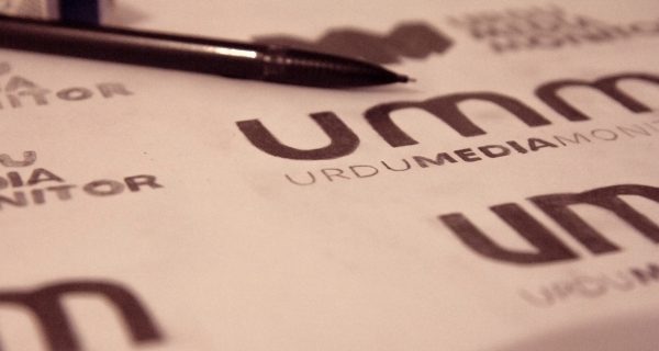
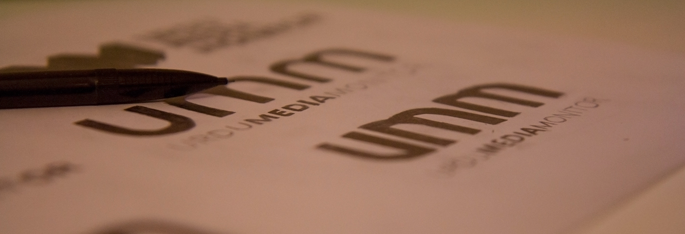
After studying Urdu typography, I realised that many letters have sharp corners, as well as some variation in stroke width. I therefore created a logotype which incorporated these aspects.
The end result was a clean, modern logo which gave the company a much more professional look.


