The Problem
The initial problem brought to me was that the business was not attracting the right customers, and the rate of growth was beginning to slow. Although the old website was attracting several thousand page views per month, the conversion rate was relatively low. The following points were the main problems I identified.
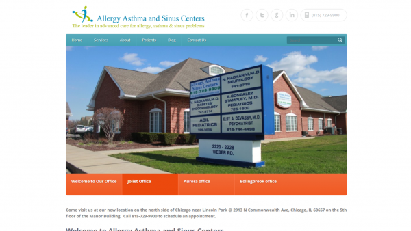
- Difficult to navigate • The website had a very complex structure which made it very difficult to find information about services. The website felt more like a blog than a corporate website.
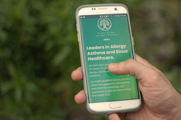
- Unresponsive • The website was not optimised for mobile. Mobile visitors were greeted with a website which did not fit on the screen.
- Outdated • The entire brand felt old and unprofessional. In addition, the logo looked generic and failed to work on many modern channels, e.g. as an app icon.
The Solution
- Restructure • After creating a sitemap of the old site, I prioritised the information and came up with a structure which was more natural and easy to navigate. The number of pages was reduced and information was made more concise.
- Re-brand • I brought on Putri Sonia to design a new logo for the business. She created a modern logo which worked across all channels.
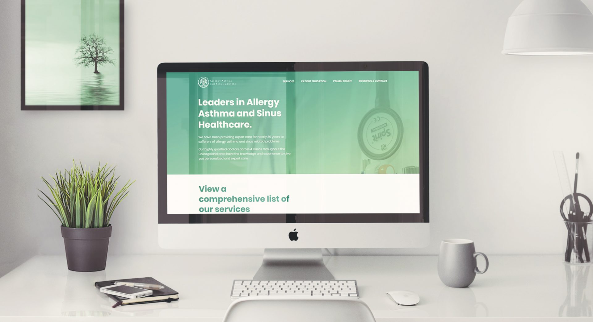
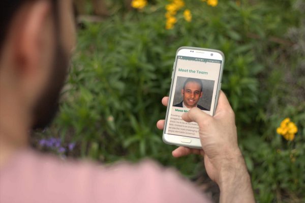
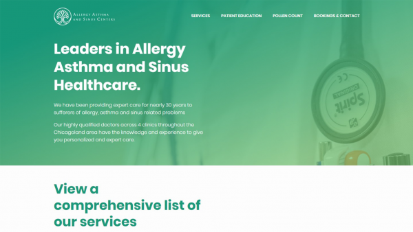
- Re-design • I created a modern interface for the website. It had a clear hierarchy and ensured that mobile visitors got the full experience.
- Office Stationary • I redesigned the letterhead template as well as the template used for contracts and forms.
“Salman did an excellent job and we have seen a noticible improvement in the number of conversions.”
Maaz Mohiuddin, business owner
